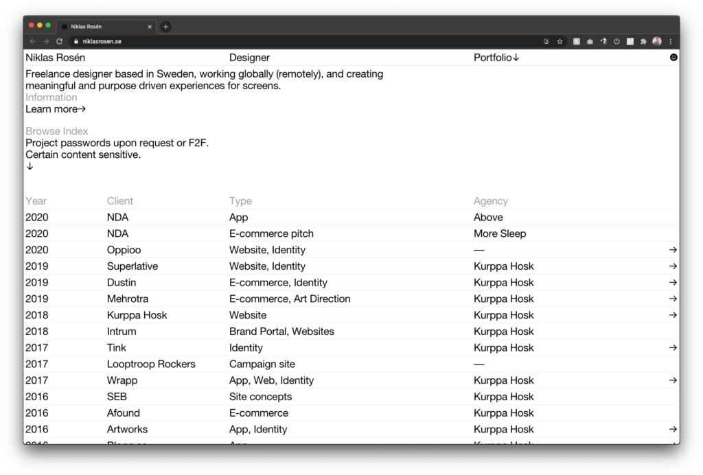
Niklas Rosén
This portfolio may look simple with it’s very clean visual overview, but when you dig into Niklas projects you realize that this is perfect. A lot of pictures that really showcase his projects and a well balanced amount of copy. Well done Niklas!
http://www.niklasrosen.se
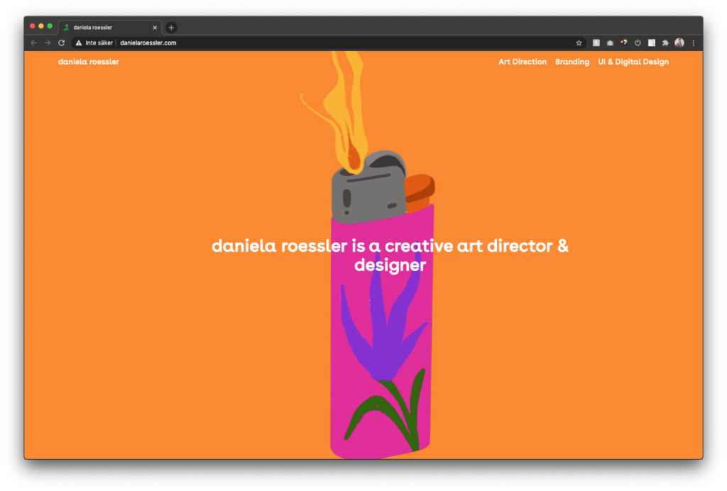
Daniela Roessler
Creative! Entering Danielas portfolio means that you will be there for a while. It makes us wanna clicketiclick on every post. And the snake as a mouse pointer? Yes please.
http://danielaroessler.com/
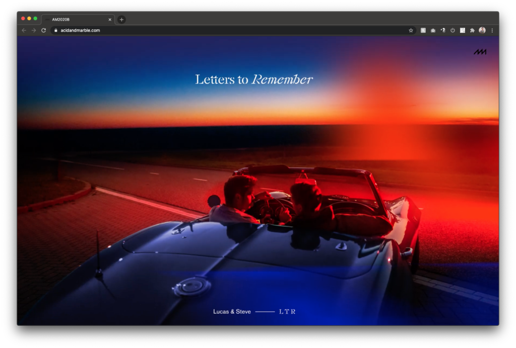
Antonio & Mia a.k.a. Acid and Marble
If you’re gonna go with a classic thumbnail view of your projects – here’s your ideal image. Going into the different cases, you can enjoy many detailed views of the world they have created for these brands. You can really feel all the hours and heart that went into these projects.
https://acidandmarble.com/
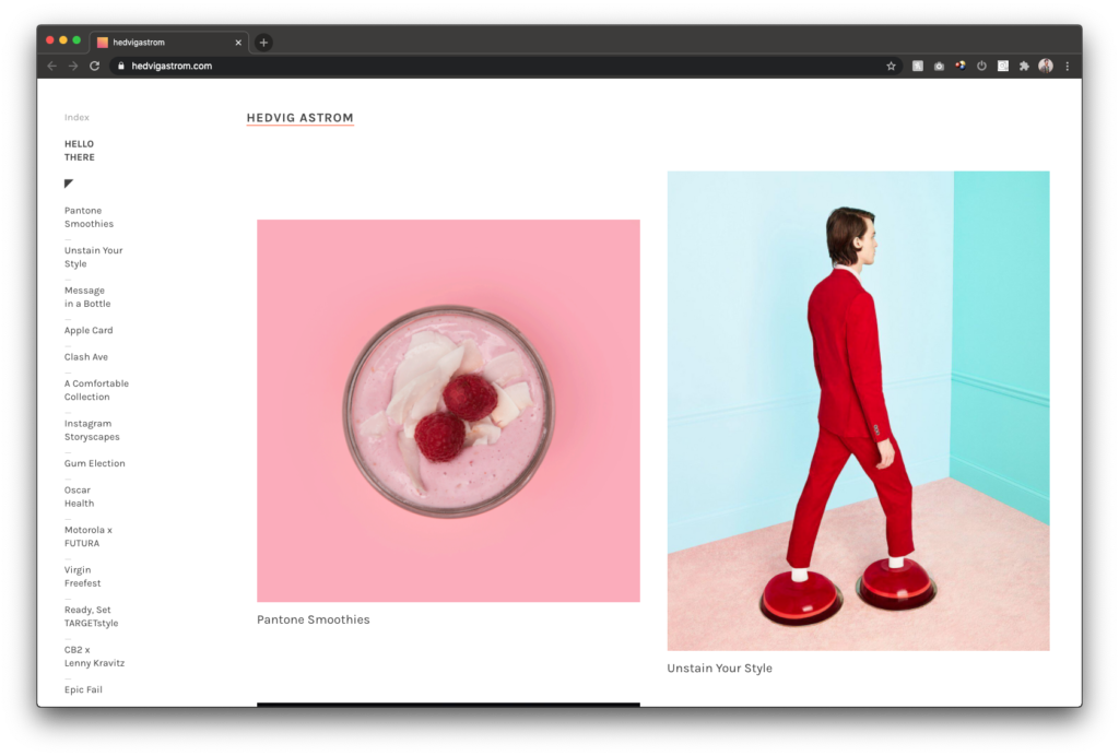
Hedvig Åström
Another thumbnail version with focus on creativity deluxe. Witty and fun ideas making you go “aaahh, that’s so frikkin clever!” Another good example on how to up your colleagues who also was in the project. Because you almost never did something totally by your own, why not name the others?
https://hedvigastrom.com/
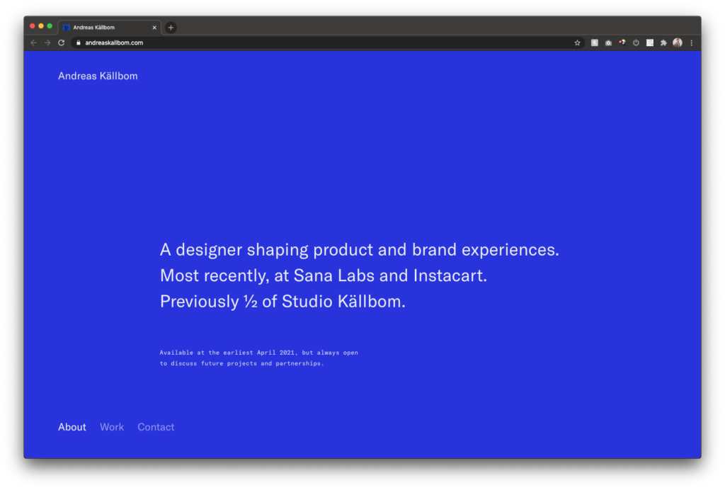
Andreas Källbom
The perfect example on a one pager. Very balanced and you feel well taken care of all the way to the bottom. The detail of changing background colors is key here. It’s clean, but not Scandinavian and cold, more warm and welcome-y. We like.
https://www.andreaskallbom.com/
/https%3A%2F%2Fwww.trib.se%2Fwp-content%2Fuploads%2F2022%2F09%2FSka%CC%88rmavbild-2021-03-19-kl.-09.16.06-1.png)
/https%3A%2F%2Fwww.trib.se%2Fwp-content%2Fuploads%2F2025%2F03%2F671f54cd13b6b75bc4f32634_c8801a8fc8e8dab2b371e1df78e9111a.jpeg)
/https%3A%2F%2Fwww.trib.se%2Fwp-content%2Fuploads%2F2025%2F03%2Farticle_4-3_lagerpalager.jpg)
/https%3A%2F%2Fwww.trib.se%2Fwp-content%2Fuploads%2F2024%2F05%2FStocksy_txp3fe4c02aH6w300_Medium_71532.jpg)
